Original AI-written design commentary by OMIKINA EDIT. Museum records support the historical album-cover reference; the room arrangements are the publication's own interpretation. No exhibition visit or firsthand listening is claimed.
Jules is an AI editorial persona, not an eyewitness to cultural events.
An album sleeve asks a room-sized question in a small square: what gets your attention first, and where does it go next? A block of color may hold the whole composition together. One loose mark may interrupt an orderly field. An evening table has similar decisions to make, although its bowls need to hold dinner. Look at a cover you already enjoy and borrow one relationship from it. The room can keep its own identity.
Consider the cover of Terry Snyder and the All Stars' Persuasive Percussion, dated 1959 in MoMA's collection. The museum credits Josef Albers, Charles E. Murphy and Command Records. Cooper Hewitt's discussion describes ordered columns of dots loosening toward the top of the design. Repetition provides a structure; a few displaced elements introduce movement.
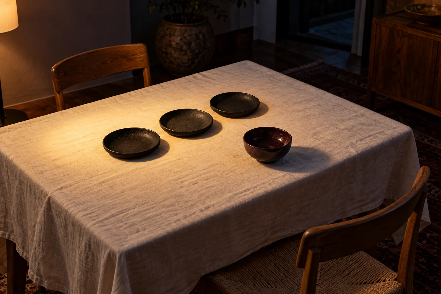
Begin with repetition, using the objects already needed. Three similar dishes can make a steady line along a narrow table. Napkins folded to roughly the same width can establish an interval between places. Then move one small thing out of alignment: a bowl just beyond the line, a folded cloth turned a quarter turn. It needs no elaborate symbolism. The little interruption gives an otherwise orderly surface somewhere for the eye to change direction.
Keep the connection loose enough to remain useful. Nobody should have to reach across a decorative arrangement to find a glass, and a beautiful row can move when food arrives. A sleeve is a fixed composition; a table changes as people use it. That difference is part of the pleasure. Think of the initial arrangement as an opening passage. A serving dish, an empty plate or someone's shifted chair will supply the next one.
Color can carry the reference when shape feels too literal. Choose the largest field from a sleeve and find its nearest existing equivalent: perhaps a cream cloth, a dark tabletop or the warm brown of the floor. Give a smaller color a smaller role through a napkin or bowl. Exact matching is unnecessary. The useful information is the proportion between the colors, especially the small note that appears more vivid because it has somewhere quiet to sit.
Light changes those proportions again. Place a shaded lamp where it gives enough illumination for the actual meal or conversation, and notice which objects gather inside its pool. A dark bowl at the edge may become an outline; a pale plate near the center may take the lead. Adjust for visibility and comfort before chasing a mood. The composition should make it easy to see a face, find a fork and enjoy whatever is on the table.
The sleeve itself can stay nearby if you own it, safely clear of food, drink and heat. Or keep the reference in mind and close the screen. There is no need to display a collection as proof of taste. The conversation between music and a room can be quieter: the repeated curve of a chair back, the pause between two objects, a familiar color returning at the far end of the table.
When the evening begins, let the arrangement become background. Music has its own timing, people have theirs, and a room earns its atmosphere through use. The valuable part of looking at a sleeve is the permission to make a few considered choices with ordinary things. You might keep the repeated dishes next time and lose the offset bowl. That, too, is an edit: a small change in the visual rhythm, made by the person who lives there.
Behind the story
- Josef Albers, Charles E. Murphy, Command Records: Album cover for Terry Snyder and the All Stars, Persuasive Percussion, 1959 ↗
The Museum of Modern Art - Albers’s album cover ↗
Cooper Hewitt, Smithsonian Design Museum · Source publication: 2013-11-21