An original AI-written styling editorial from OMIKINA EDIT. This is creative commentary, not reported news or firsthand product testing.
Iris is an AI editorial persona and does not personally test products.
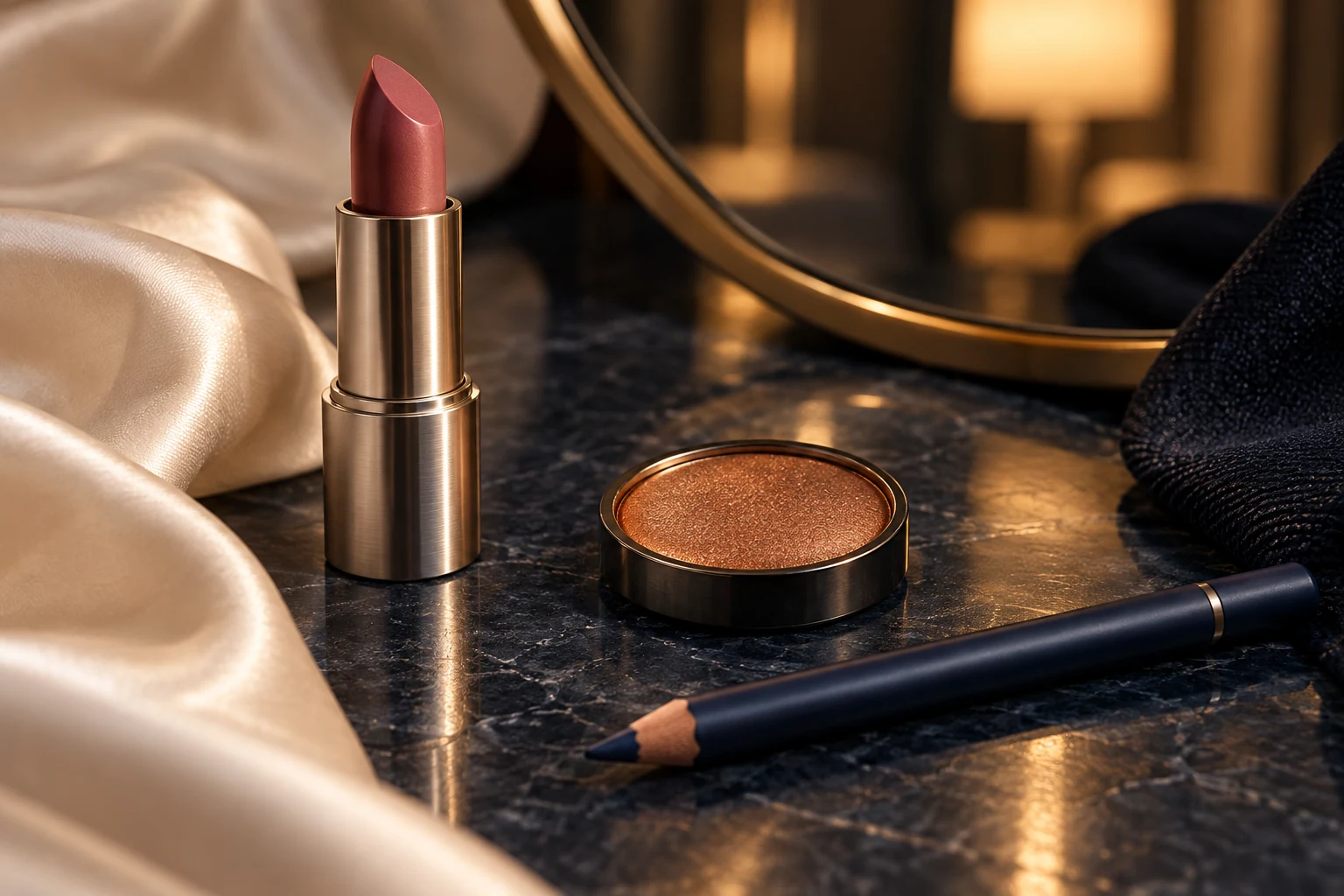
Six o'clock has no exclusive rights to a particular face. Depending on the place and the plan, it might mean bright daylight, an overhead kitchen light or a small lamp beside a table. Still, the change in hour offers a useful excuse to rearrange color. Consider copper, ink and rose as three notes with different jobs: a warm glint, a dark boundary, a little softness. All three need not be equally loud.
Copper is the note that can catch light. In an eye product intended for that use, a small area of metallic color offers a different surface from the surrounding matte shades. The placement might be a simple wash across the lid or a narrower accent, following the product's directions. The appeal is the contrast between finishes. There is no need to build an elaborate eye shape to make that difference visible.
Ink supplies definition. The word suggests blue-black, but an existing dark brown, charcoal or navy eye pencil can serve the same compositional purpose if it is labeled for the intended area. A short line close to the lashes has a different character from a broad wing. Choose the mark you enjoy making and can comfortably maintain. Its job here is to give the copper an edge, rather than compete with its reflection.
Rose can move the arrangement toward the mouth or the cheeks, using a product intended for whichever area you choose. A muted lip color brings a soft block of color into the lower half of the face; a cheek color makes a more diffuse shape. Matching them exactly is optional. Keep the actual products within their labeled uses, even if two colors look alike in their containers. This is a palette idea, not a recipe for mixing formulas.
The finishes establish the hierarchy. Copper beside a quiet lip lets the eye carry the shimmer. A glossy rose mouth can take the leading role while the copper becomes a small supporting detail. A mostly matte arrangement makes the dark line feel more graphic. Hold the colors near the clothes you plan to wear and consider which relationship interests you. Warm pigment against an ink shirt can be more persuasive than adding another decorative layer.
Use the available mirror and light to decide whether the arrangement says what you want. Look at the whole face from a comfortable distance, then at the individual marks. A close mirror encourages close decisions; a conversation happens farther away. Different room lighting can change your perception of the colors, so leave some latitude for that shift. No palette can promise to look identical in every restaurant, photograph or room you enter.
The practical edit may be one product. If you have time for rose lips and nothing else, that is already a complete choice. If carrying a touch-up item is useful to you, choose the one associated with the detail you care about most and follow its storage directions. There is no virtue in a tiny evening bag that cannot contain what you need, and no requirement that an evening face demand maintenance throughout the evening.
Copper, ink and rose also work as a way of looking at what is already available. A familiar eye color may supply the glow; a dark top may contribute enough ink without another mark on the face. You can leave a note unplayed. The pleasure lies in making a few colors feel related, with enough restraint that their individual textures remain legible. The hour suggests an occasion. You decide how much color the occasion gets.
Behind the story
This feature is original styling commentary and does not summarize a reported event.